
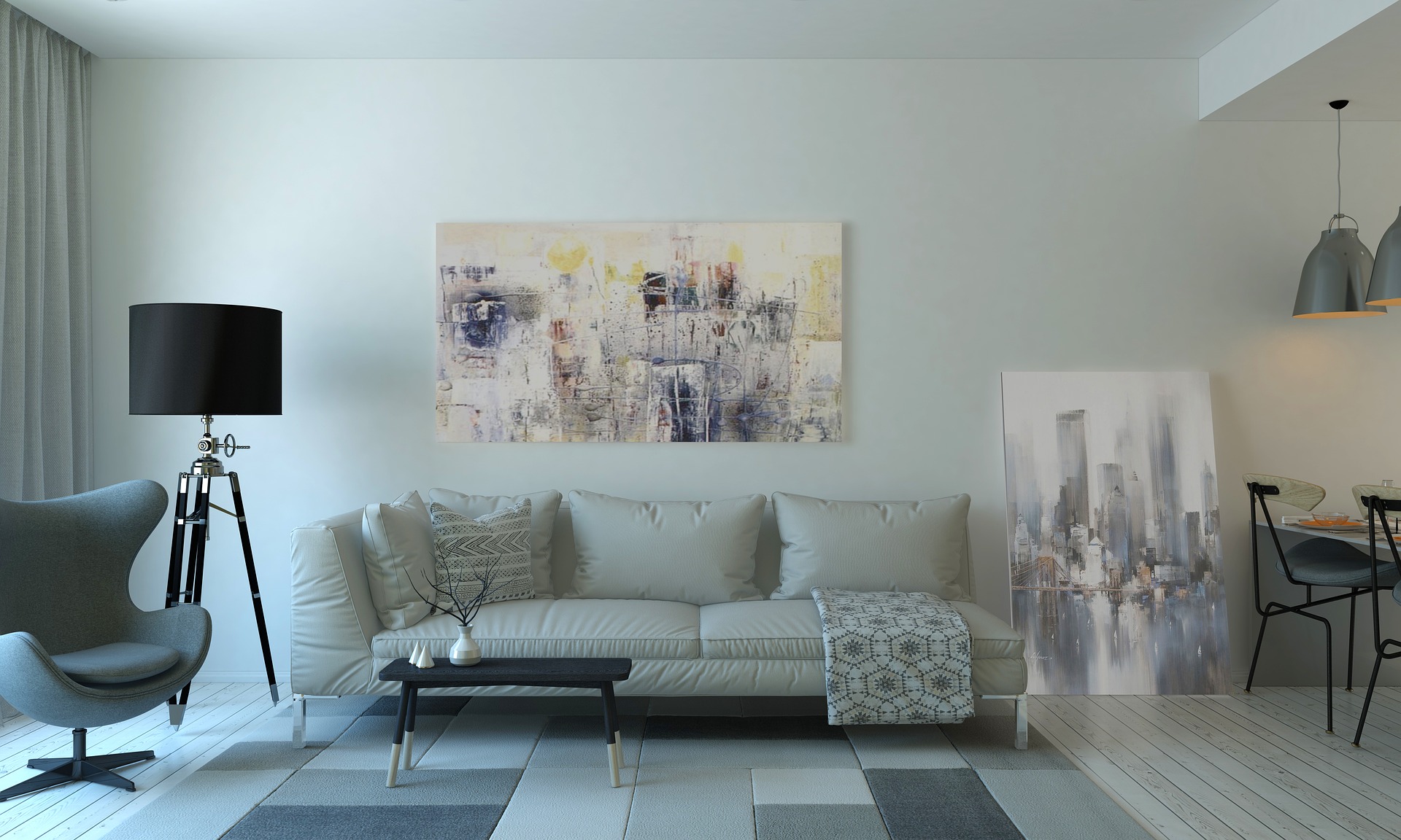
Contrasts in the home create a beautiful, harmonious balance in your living space. With elegant focal points your room won’t be left with empty corners and open, bare space after you follow these tips to a contrasting home full of life, character, and warmth. If you’re unsure where to start, looking at online fabric retailers such as Couture Living is one step towards getting the creative juices flowing in introducing contrasting elements to your home.
Fabrics
Incorporating a variety of fabrics around the home, particularly in the form of made to measure curtains and blinds really adds to the definition and feel of your living space. There is nothing like making a room more cosy and homely than thick, lined curtains in an open window space, marking a beautiful focal point to any room in the home.
If you’re not into your patterned wall papers and feature walls, then the fabric in made to measure curtains is certainly one way of breaking up the space. You can consider pairing two different patterns together, for example, a floral curtain will pair beautifully with some striped scatter cushions. As long as they’re not placed directly next to one and other, you’re going to create a beautiful, contrasting, and indulgent home environment.
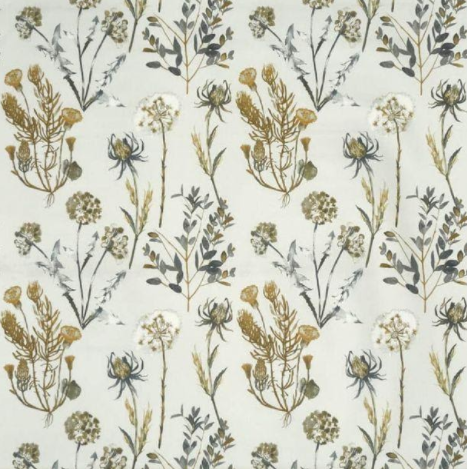
Image Credit: Couture Living
Pattern
Don’t be afraid to experiment with patterns around the home. This doesn’t necessarily mean going over the top and splashing them everywhere but having the best placement for your patterned furnishings to create a harmonious environment and contrasting interior décor. We’ve explored so many ways to create a beautiful interior through patterns and we’re here to share some fantastic tips.
Firstly, you should ensure you balance the room out when pattern placing. If you place too much of the pattern on one side of the room, you may feel like the room is very unbalanced and uneven. Try to avoid the place looking too chaotic by allowing your eyes to have a place to focus with no pattern whatsoever. This is okay when incorporating patterns in your home, in fact it’s the perfect interior design trick to allow a space for your eyes to relax, for example, a solid block of colour instead of a patten is great for creating the perfect balance and contrast.
Contrasting Colour Tones
One important thing to consider when looking into contrasting colour tones in your living space is to keep the colour palette simple. Try to use no more than 3 colours in the same colour scheme to keep the contrast minimal but effective. Some colours to consider together are:
- Gold and Royal Blue
- Baby Blue and Blush Pink
- Olive and Blush
- Navy and Sand
- Sage and Stone
These colour palettes offer a beautiful contrast in tones without over doing it in your living space. There is so much to work with and experiment when changing up your interior style. Ensure you pair the perfect colour palette with stunning fabrics and patterns for the most beautiful, elegant, contrasting interior décor.